Happy hump day, folks!
Noticed something different here, did ya?
It’s been at least three years since I’ve had the plain blog theme that you’ve been accustomed to seeing if you’ve recently joined us (hello!). That’s like wearing the same undies and not changing for … okay let’s not even go there. You get the drift. 😛
When I first started Beautyholics Anonymous, I had a variety of layouts and designs. I’ve done purple, I’ve done red and white and I’ve even dabbled in a whole lot of pink. Three years ago, I decided to give the blog and Beautyholics Anonymous a brand and that was when I came up with the black, red, white and grey logo you’re familiar with. As I’m an advocate of maximising the amount of white space, I gave my blog a very simple theme. It served me well for three years but it’s time to move on and refrock.
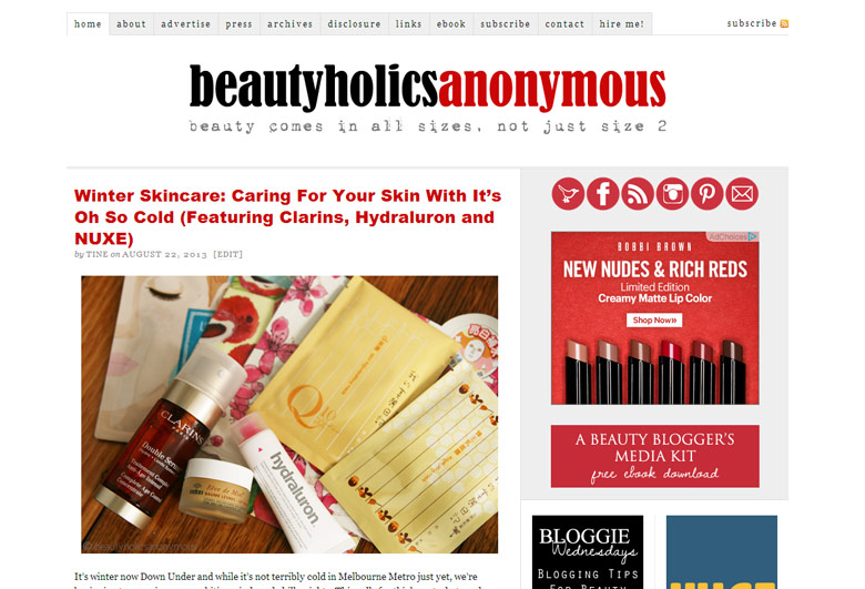
I tried out magazine themes and quickly realised that it’s not what I wanted. I’m a strong believer that a blog should look like a blog, which means that you see the latest post on top and the earlier ones going downwards in chronological order. This is not to say that magazine-styled blogs are wrong for I’ve seen many really stunning designs. At the end of the day, it’s just not for me.
I tried rebranding the name and website by giving it a more feminine touch. Oh boy, that made it worse. I absolutely love pretty, feminine-looking websites with pastels, cursive fonts that are so fancy, it makes me almost need to curtsey in its presence. I tried a few designs that made Beautyholics Anonymous look sweet and feminine. It wasn’t long before I threw in the towel. It felt wrong. What can I say? I just can’t do frilly and feminine. Damn. 😛
In the end, after months of indecision, I took a good look at my current design and decided to work from there. There must be a reason I stuck with this design for so long. What was it that I liked about it that made me hang on to it? After days of putting my foot down on the necessary elements and coding, I finally came up with something I liked.
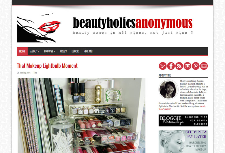
At that time, even though I did like it, I was unsure if it would work. I had an extra sidebar that made it look a tad cluttered. What happened to the amount of white space I wanted? After consulting LeGeeque and Paris B, I made more tweaks to the design and finally came up with something I love.
The new design has the amount of white space I needed that was still enough but not threadbare. I stuck with just one sidebar to avoid filling it up with junk I don’t need. I added an image to my logo (check out those gorgeous red lips!). This time, I made the content wider in order to fit larger and clearer images, which is something I’ve always wanted to do. It’s responsive, which means that you’ll be able to view this easily on any mobile device, phone or tablet.
I want to concentrate more on content viewing this time, whether you’re on the desktop or viewing this on your phone. I want the text to be easily read (old and almost blind-as-a-bat eyes like mine need big fonts, y’see) and the images easily viewed.
After rambling for many paragraphs, I hope you like it as much as I do. It’s still a work in progress and I’m still ironing out any kinks I see. If you manage to break something (and I hope you do!) on the blog, please let me know so that I may fix it as soon as possible.
Welcome to the new Beautyholics Anonymous of 2014. 🙂







Love it. It’s still very clean but a bit more punchy.
Thanks Shamim. I like punchy. 😀
Looks amazing!!! Love the new header logo too!
Jess @ Miss J. Shopaholic recently posted..NARS Fall 2013 Single Eyeshadows in Yamal, Bavaria & Kamchatka!
Thanks Jess! Time for new business cards, don’t you think? 😉
Really really love it Tine – clean, but interesting and attractive without being sugary sweet ‘pretty’ (I’m not a barbie girl either).
😀 Go you with the style and class 😛
Thanks Hilary! I tried sugary sweet pretty because I love a lot of websites and blogs that have that sort of themes. Sadly, I couldn’t do it. 😛
I love it. You are right, those red lips are epic!
Tegan @ Tegania’s Thoughts recently posted..Illamasqua Precision Ink in Abyss {Review}
Haha coming from a red lips lover, I knew you’d say that! 😉
Noticed it last night and I went “Woooo Nice!”
Love it and so jelly of your coding skills!
Tina recently posted..Randomly Me: Magazine Haul and the Loophole to Beauty Shopping
Aww thanks! I didn’t create this from scratch; I’m not that good. Just did a big overhaul on the original design, is all. 🙂
Congrats on you refrock, it looks amazing Tine! I even used my work computer to sneak a proper look lol. It was totally worth getting caught 🙂
I’ve always loved your colours because they are so unmistakable and strong. In a sea of pretty, pink, frilly blogs (like mine, ahem), it really makes you stand out. It’s one of the things I love about you and your blog. My hat goes off to you for all the coding and effort I know it takes.
Well done! xx
Kaye recently posted..Whats In My Bag – The Traveller
Aww thanks Kaye! Coming from you, means a lot to me since you’re like a super fab graphic designer artist person :P.
Hey, yours is a frilly blog that I really like, k?
Looking good so far! Yeah, I tried the feminine pastel type ones too…Umm…nice to look at but definitely NOT ME either! 🙂
Norlin recently posted..Simple Nail Art Ideas: Foils And Decorations
Hahaha I know, right? Different styles suit different people and feminine pastel ones just isn’t me. Which is a pity ‘cos the ones I bookmarked for inspiration, I really like and wanted to look like but … nah, it’s not me at all.
Yay Tine it looks absolutely fab! I’m so glad you didn’t go the way of pastels and pinks and frills. So trite, so insipid and I know you aren’t 🙂 I thought about it myself when doing my redesign a while ago but I knew I’d stab myself with a fork every time I looked at my own site 😀 Well done! If I ever need a redesign I’ll come knocking on your door 😉
Paris B recently posted..Alpha-H Liquid Gold with Glycolic Acid is liquid gold for my skin
Thank you thank you! Really appreciate your feedback and to do away with the narrow sidebar. Remember when I told you I wasn’t sure about the design and wanted to redo? It was all because of that narrow sidebar that made it look too cluttered. I’m glad I didn’t waste time redesigning and just tweaked this one to what it is now. Best thing about it being responsive is that I can easily reply to comments on mobile devices and the words are so big and so awesome! (eyes are old already, need large print :P)
love it!!! so chic yet simple. mine is also due for a makeover!
xin recently posted..Oil Up! Loving the L’occitane Almond Shower Oil & Supple Skin Oil
Thanks Xin! If you need help, just holler *nudge nudge wink wink* 😛
totally loving it tine 🙂 and please check your email asap..thanks
Thanks lovely! x
I love the new design! I like the fact that your fonts and photos are bigger and you used white as the background because it means everything is clearer. Love your blog header too and that red lips 🙂 3 years is indeed a good time for a change especially if you want something refreshing.
Thanks Victoria! I love the large print now, especially on mobile devices. I checked my Google Analytics and it’s viewed the most on phones. Now that it’s using a responsive theme, the fonts are bigger than the old mobile theme and I absolutely love it. 😀
New blog header would also mean new business cards. Wheeeee!!
I like the new design! I don’t really have anything more meaningful to say than that, but I think it’s an improvement so yay! 🙂
Rebecca B. Bird recently posted..Weekly Poll: Discontinued products in beauty boxes?
Thanks Rebecca. Good enough for me! x
I love the new design, it looks chic and professional! The header is beautiful too.
gio recently posted..Product Review: Sunsilk Co-Creations Volume Al Massimo Shampoo Teddy Charles
Thanks Gio! I’m really loving it too (big fonts = best). 😛
Love the new frock, especially the header with the red lips *reeoowww* 😉
Thankies! Time for new name cards, woohoo!! 😀
I love the new design Tine! 🙂
Thanks Issa! x
Loving the new makeover! And those juicy red lips too – congrats Tine! Looking forward to reading your posts again this year! Hope to catch up soon xx
Niva recently posted..Hot Yoga.
Thanks Niva! Yes, let’s catch up soon! x
I’m finally catching up on some blog reading and have to say that I love your new design. My blog needs a refresh too and I’ve engaged a designer to come up with a new header because I cannot hope on le hubby to create another one for me.
lyn recently posted..Gong Xi Fa Cai – 2014
Thanks Lyn. Hahaha at least your hubby can create one. Mine asks for help with the printer (as in “er, can I print photo ah?”). 😛